 AUEC '26 Semester One Roadmap
 Fig 1. 2026 Semester One Roadmap Instagram
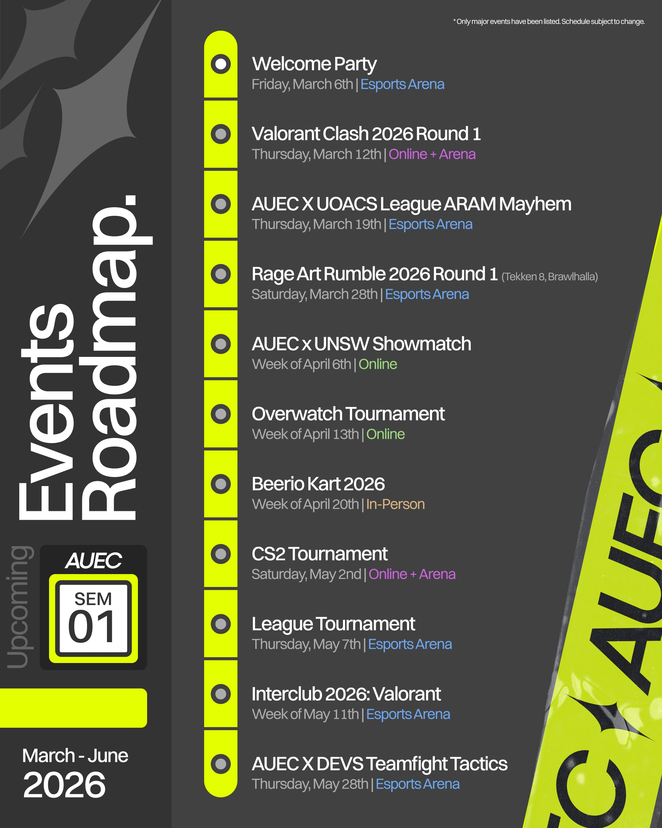
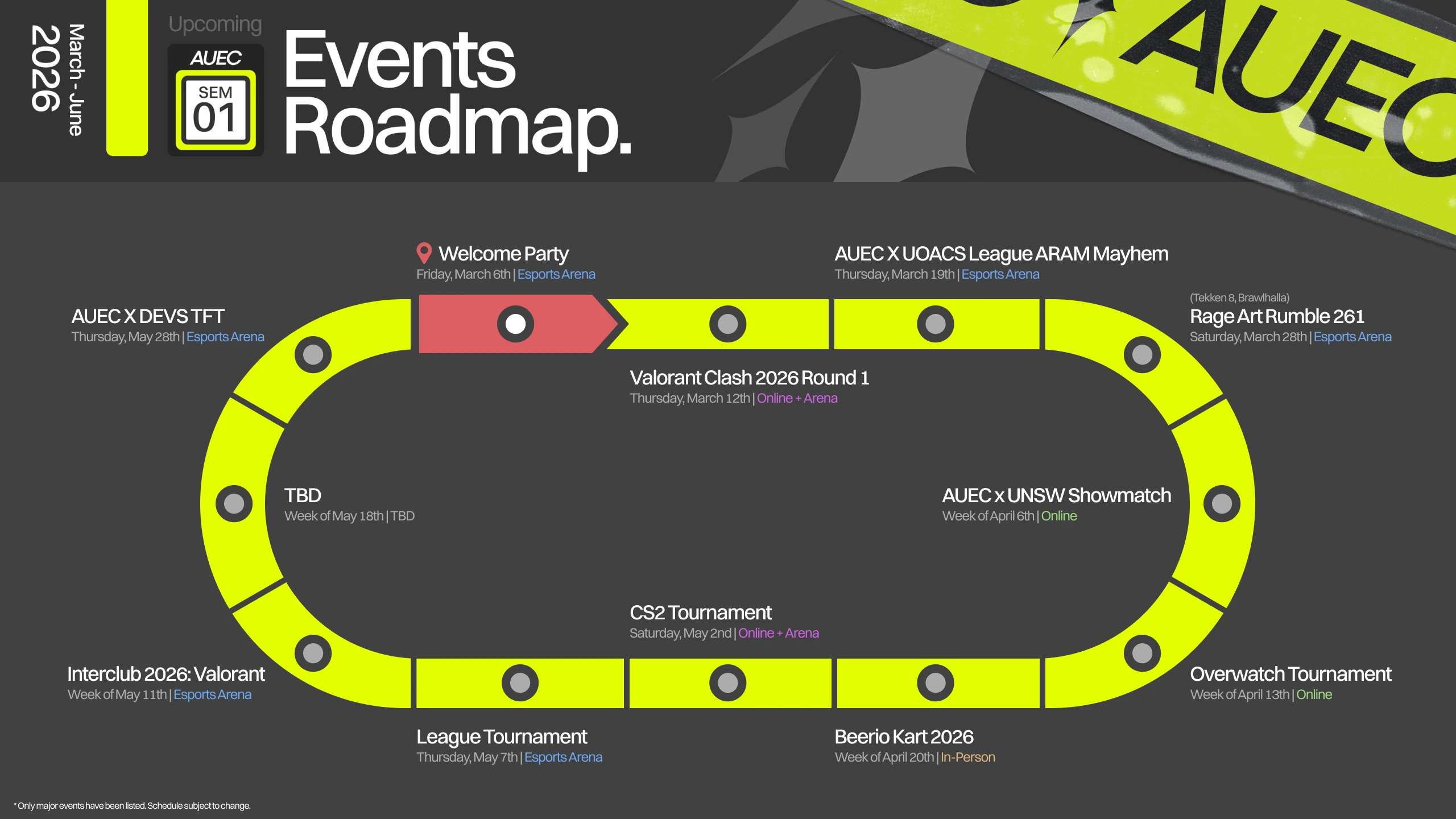
Fig 2. 2026 Semester One Roadmap Desktop
Graphic Design
(Feb’26)
AUEC '26 Semester One RoadmaP
For Auckland University Esports Club
A big part of why I volunteered at AUEC revolved around trying to push the envelope forward, especially when it came to design. The student club designers at the University of Auckland had some incredible creative direction at the time (pastel-colour/vector-art TANSA, scrapbook JAM+, etc.), and the 2025 AUEC design team had to put in a lot of work to catch up. With that in mind, I wanted to experiment with different ways sequential information was visually presented to help us stand out from the crowd. I had just wrapped my internship in Sydney when working on this project, and while I mainly commute via bus back home in Auckland, the three months of commuting via train were still fresh on my mind at the time. This inspired me to look at train routes as a potential foundation for the roadmap's design. The completed roadmap is based on the passenger information displays found on JR trains—the simplicity of the base design gave us a lot of room to add auxiliary information and personal flair. Although I had sprinkled it throughout the club website's staff dashboard, this was the first time we featured the highlighter yellow as an accent on a poster. The tape (inspired by Virgil's Luv is Rage 2 cover design) was something I added in after completing the majority of the poster, as I felt like everything felt a little visually stiff. One important lesson I took from this is that things that initially seem like good ideas can be a pain in the backside down the line. With the introduction of a "station schedule" roadmap, our team decided to attach a station badge to each event poster. Although this worked out fine at the start, it began to impose a lot more restrictions on how we could use our space, given that we already had to make space for our logo, event details, sponsors, and so on.