 AUEC '25/'26 Design Overhaul
 Fig 1. Design Update Proposal
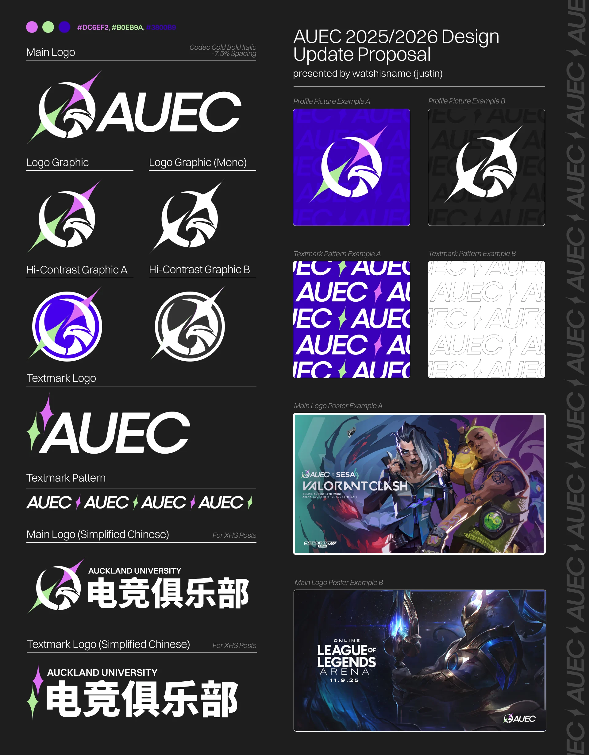
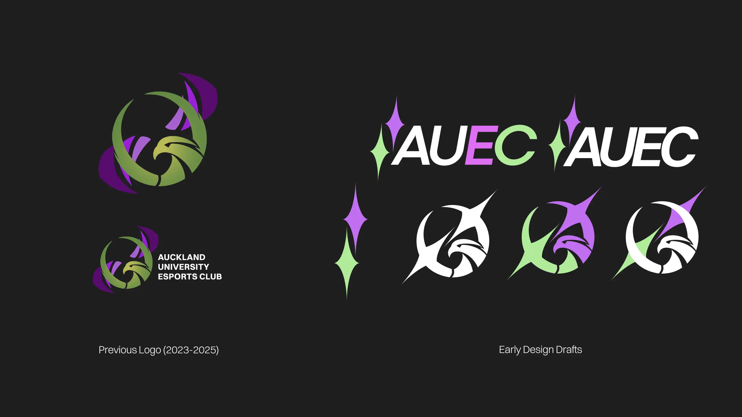
Fig 2. Original Logo & Drafts
Graphic Design
(Sep’25)
AUEC '25/'26 DesiGn Overhaul
For Auckland University Esports Club
Out of all the poster designs I worked on for AUEC, the most pain-in-the-ass project had to be AUEC x SESA Valorant Clash. I was pretty frustrated with management rolling back major aspects of the design (e.g. the event title) and repeatedly requesting minor adjustments (fonts, positioning, etc.) after each submission. But the biggest issue I encountered was the incompatibility between SESA's more conventional icon + wordmark logo and our club's logo, which was just "Auckland University Esports Club" formatted as plain text next to the club emblem. After reflecting on this project, I thought about the two primary issues behind it: a) a lack of established guidelines for how management should work with designers when requesting revisions, and b) the inflexibility of the existing logo. I saw these as symptoms of an immature design pipeline, and I communicated these points, alongside potential solutions, to the management team—the first of which was the design overhaul. Seeing as my main qualm with the previous logo was the lack of an appropriate textmark, I framed my proposal to focus on that aspect of the design instead of reinventing the wheel on the eagle icon. The original icon had a lot of charm to it, but its colour scheme and awkward shape made it difficult to format within a design. The kite-star found throughout the new design represents the Southern Cross, which I intended as an homage to—and an abstraction of—the original's NZ shape motif. The colour scheme was also adjusted to become more vibrant, presenting our club as more energetic. This design proposal marked an important point in my time working with AUEC. I took the initiative to make a change in the organization that reduced the obstacles designers faced while working. The rebrand was adopted as the club's standard identity, and shaped how the design team approached projects going forward.