 AUEC '26 S2 Club Expo Poster/Roadmap
 Fig 1. Club Expo Poster
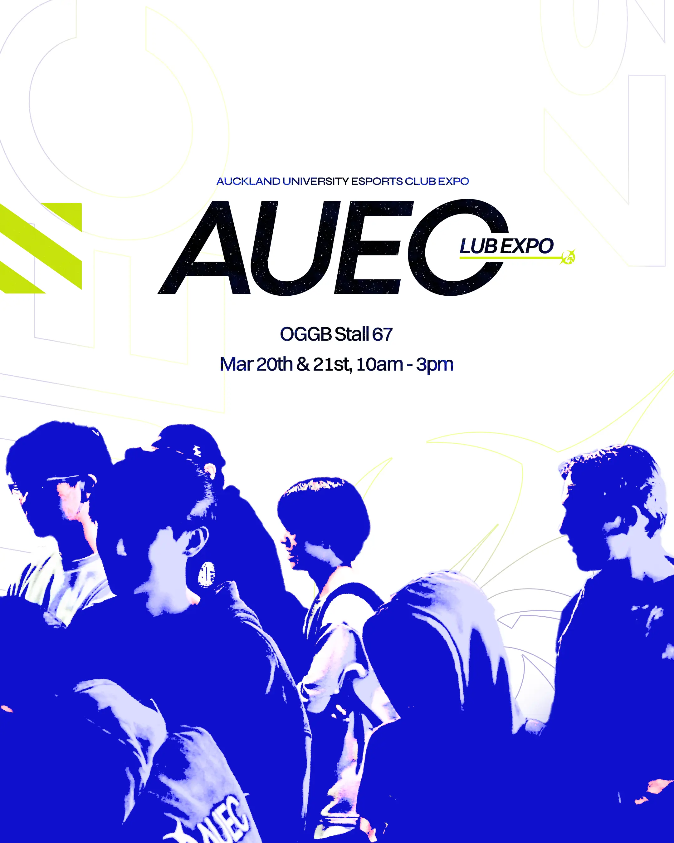
Fig 2. Roadmap
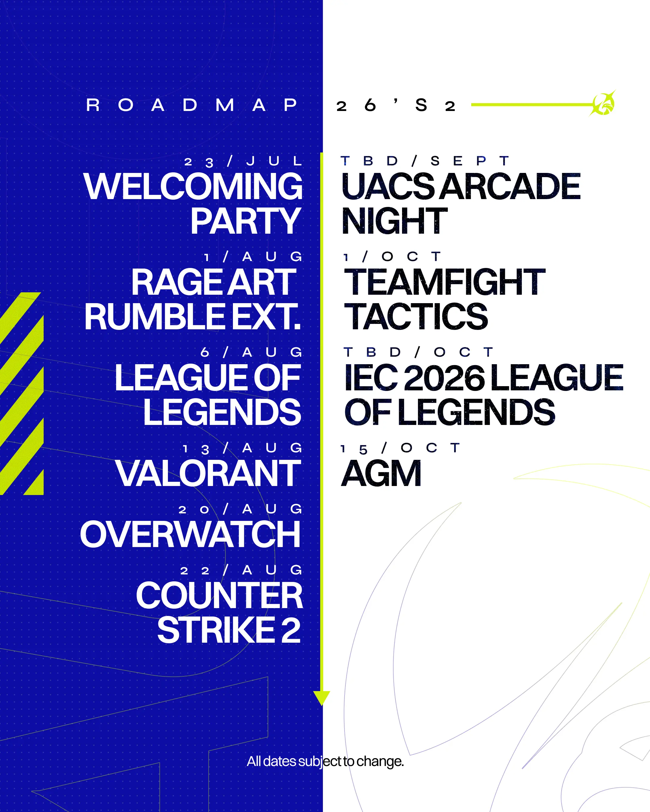
Fig 3. Club Expo Poster Draft
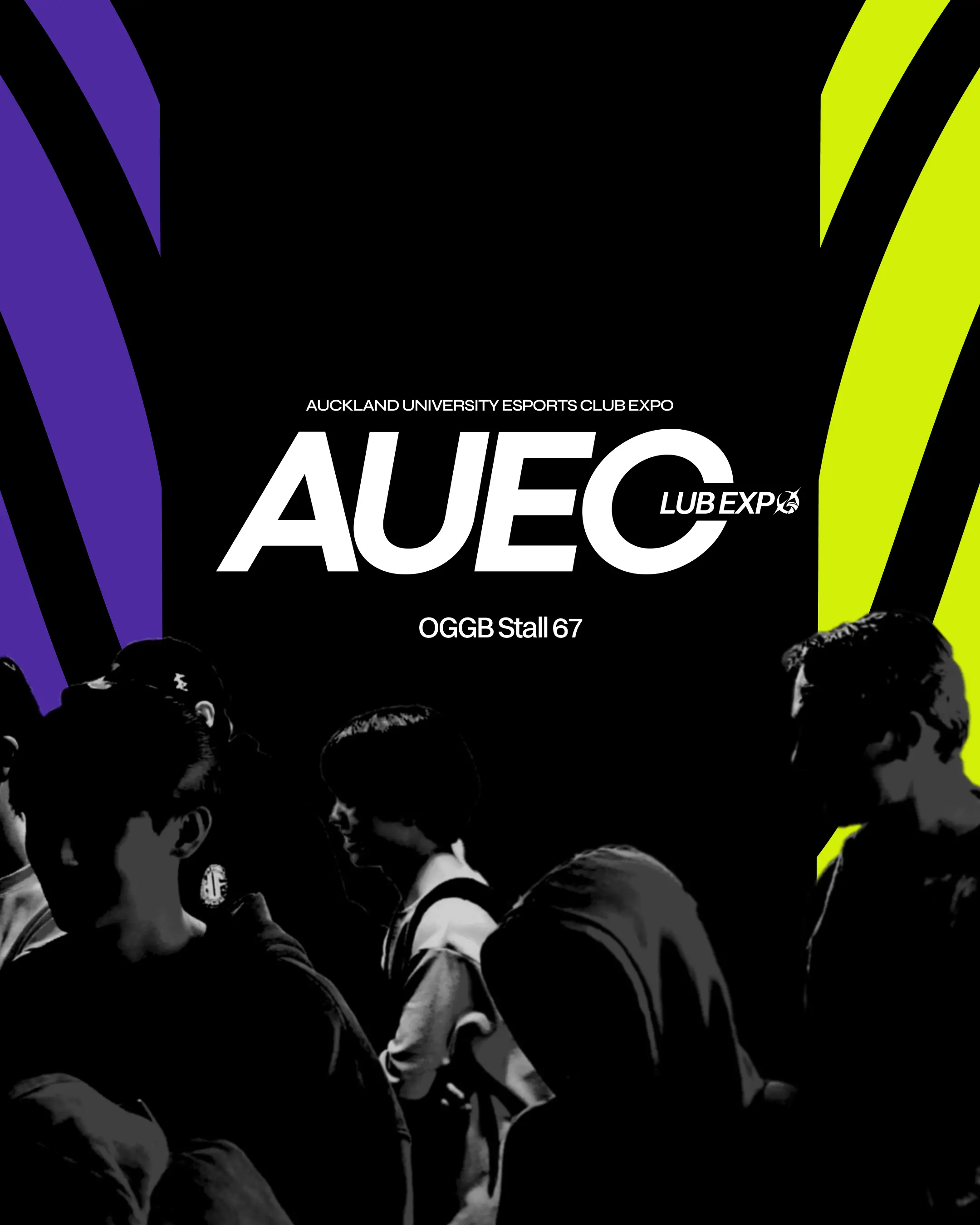
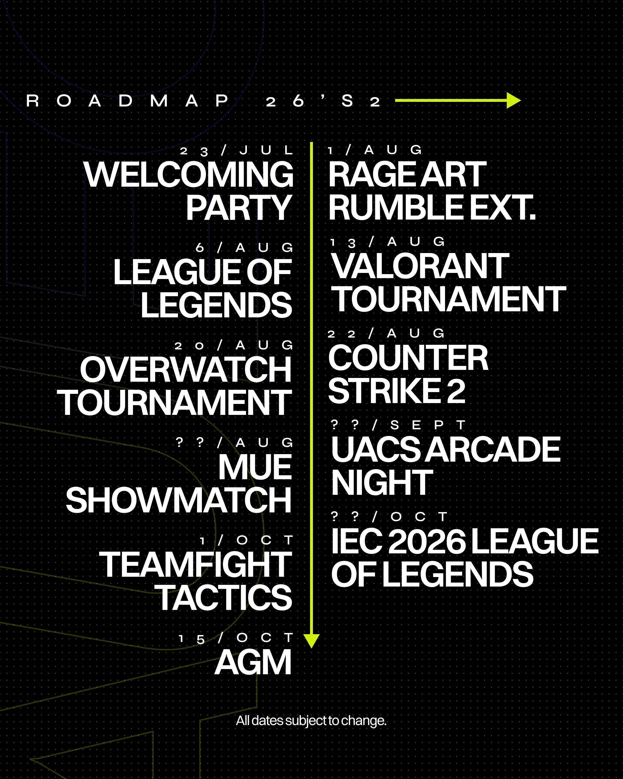
Fig 4. Roadmap Draft
Graphic Design
(Jul’26)
AUEC '26 S2 Club ExPo Poster/RoadmaP
For Auckland University Esports Club
|
In Collaboration with Leon Huang
Building off the visual aesthetic from the semester two brochure, Leon and I experienced a lot of creative block trying to figure out how to navigate the design. While it would've been easy to duplicate the brochure's theme one-to-one, we wanted to give it our all and create something visually distinct. I experimented with different ways to arrange the layout so that our schedule could make good use of the space and be visually intuitive. We decided to go with two columns of events separated by a downward arrow to signify the two halves of the semester. The hazard markings found throughout the poster were design cues I took from GraphersRock, who I'd been inspired by quite a lot over the past few months. The colour palette we went with was an absolute home-run from Leon, in my opinion. We initially started off with the same black/purple/yellow scheme from the brochure, but using deep blue as our primary colour really established the distinctive look we set out to create.